
Are you running a business in the 21st century and not taking advantage of mobile-friendly technology? If so, it’s time to catch up! Having a website that looks great, functions properly, and is responsive no matter what device it’s being viewed on has become essential for any business looking to stay competitive. Achieving these goals can seem daunting, but by understanding the basics of responsive design and how to apply them properly you can make sure your site is optimised for users browsing from their phones or tablets – without spending months redesigning an entire website. In this blog post we’ll discuss how adaptive design changes the game for businesses today and show you practical steps you can take to create a mobile-friendly experience.

What is Responsive Design?
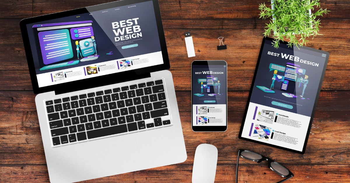
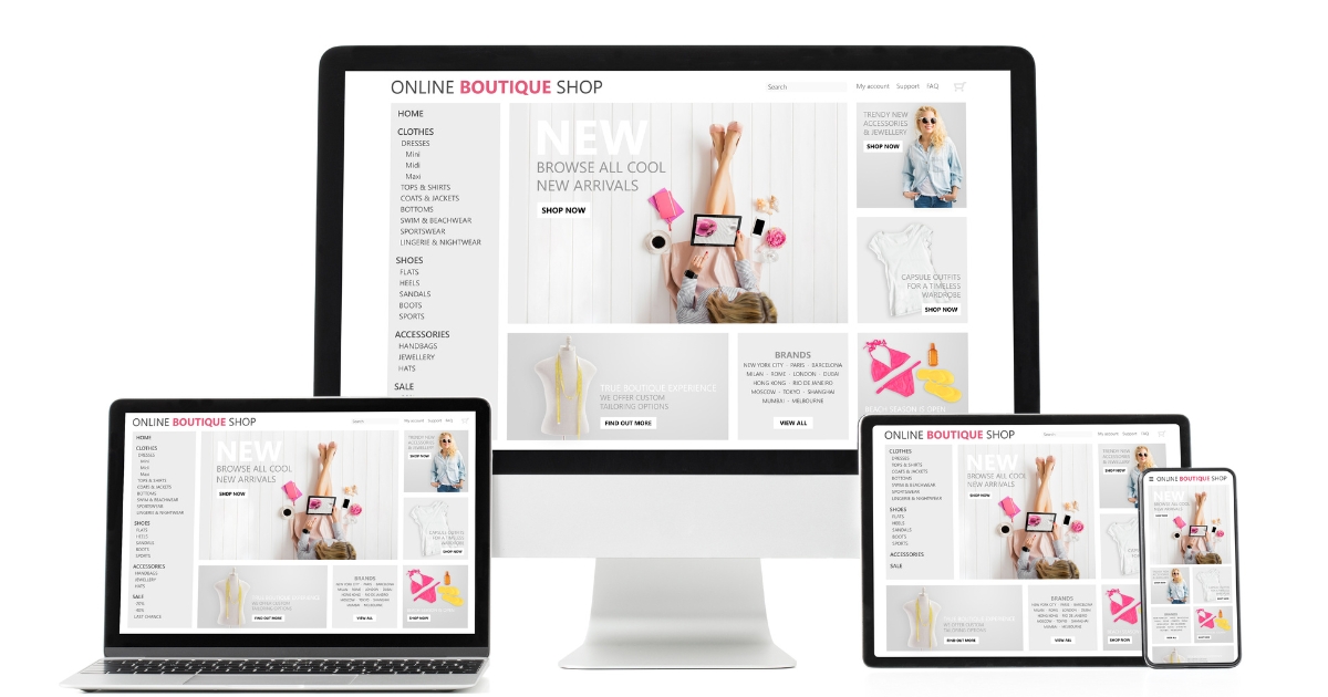
Responsive design refers to the method of creating websites that automatically adapt to the size and orientation of the device being used. This means that the layout, content, and functionality of the website will adjust to provide the best possible user experience, regardless of whether the site is being viewed on a desktop computer, tablet, or smartphone.
Key Concepts and Principles:
1. Fluid Layouts: Responsive design uses fluid layouts that expand, or contract based on the size of the device’s screen. This allows the site to maintain its design integrity, even when viewed on smaller screens.
2. Flexible Images: Responsive design also uses flexible images that scale up or down based on the device being used. This ensures that images are always optimised for the best viewing experience.
3. Media Queries: Media queries are a key component of responsive design and are used to specify different styles for different devices. These styles are defined based on the screen size and orientation of the device.
4. Adaptive Navigation: Responsive design also incorporates adaptive navigation, which adjusts the site’s navigation to be optimised for smaller screens. This ensures that users can easily access all the site’s content, regardless of the device they are using.
How Responsive Design Works
Responsive design works by using a combination of fluid layouts, flexible images, media queries, and adaptive navigation to ensure that the site’s content is always optimised for the best viewing experience. When a user visits the site, their device is detected, and the appropriate styles are applied to ensure that the site is optimised for the device being used. This process happens automatically and in real-time, ensuring that the site is always up-to-date and providing the best possible user experience.
Benefits of Responsive Design for Business Owners
1. Increased Accessibility: By having a responsive website, you can ensure that your site is accessible to the largest possible audience, regardless of their device. This will lead to increased engagement and conversions.
2. Improved User Experience: A responsive website provides a seamless user experience, regardless of the device being used. This will result in increased customer satisfaction and loyalty.
3. Increased Search Engine Optimisation (SEO): Responsive design is recommended by Google, and it can improve your website’s search engine ranking. This will result in increased visibility and traffic to your site.
4. Cost-Effective: By using responsive design, you only need to maintain one website, rather than separate sites for desktop and mobile devices. This is much more cost-effective than traditional design methods.
Responsive design offers a wide range of benefits for business owners, including increased accessibility, improved user experience, increased SEO, and cost-effectiveness. By using responsive design, you can ensure that your website is optimised for all devices, providing the best possible user experience for your customers, and increasing your business’s success in the digital landscape.

Elements of Responsive Design
Flexible layouts are a key component of responsive design, and they enable the website’s layout to automatically adjust based on the size of the device’s screen. This is achieved by using percentages and flexible units, such as ems and rems, instead of fixed units, such as pixels, to define the website’s layout. This ensures that the layout will always be optimised for the best viewing experience, regardless of the device being used.
Fluid images are another important element of responsive design, and they enable the website’s images to automatically scale up or down based on the device being used. This ensures that images are always optimised for the best viewing experience, regardless of the device’s screen size or orientation. To achieve this, the images are defined using flexible units, such as percentages, rather than fixed units, such as pixels.
Media queries are a powerful tool in responsive design, and they enable the website’s styles to be customised based on the device being used. Media queries use CSS to define different styles based on the screen size and orientation of the device. For example, a media query could be used to display a larger font size on a tablet than on a smartphone, to ensure that the content is easily readable on the larger screen.
Adaptive navigation is another important element of responsive design, and it enables the website’s navigation to be optimised for smaller screens. This is achieved by using techniques such as hamburger menus, which hide the site’s navigation behind a button that can be revealed when needed, and responsive drop-down menus, which adjust the size and placement of the site’s navigation based on the device being used. This ensures that users can easily access all of the site’s content, regardless of the device they are using.
Flexible layouts, fluid images, media queries, and adaptive navigation are all key elements of responsive design that work together to ensure that the website is optimised for all devices. By understanding these elements and how they work together, business owners can ensure that their website provides the best possible user experience for their customers.

Testing and Debugging Responsive Design
Browser testing is an essential step in the responsive design process, and it involves testing the website on a wide range of browsers to ensure that it works well and looks great on all devices. This can include testing the website on popular browsers such as Google Chrome, Mozilla Firefox, Apple Safari, and Microsoft Edge, as well as older browsers that are still in use by some users. By testing the website on a range of browsers, businesses can ensure that their website is accessible and usable for all users, regardless of the browser they are using.
Emulator testing is another important step in the responsive design process, and it involves using software tools to simulate different devices and screen sizes to test the website’s responsive design. This can be a useful way to test the website on devices that you do not have access to, and it can also help you to identify any issues that may not be immediately obvious when testing on a real device. By using emulator testing, businesses can ensure that their website provides an optimal viewing experience for all users, regardless of the device they are using.
User testing is a critical step in the responsive design process, and it involves testing the website with real users to get feedback on the website’s usability and functionality. This can include conducting surveys, focus groups, or usability tests to get a better understanding of how users interact with the website, and to identify any issues or pain points that need to be addressed. By conducting user testing, businesses can ensure that their website is accessible, usable, and effective for all users.
Debugging techniques are an important aspect of testing and debugging responsive design, and they involve using tools and techniques to identify and fix any issues with the website. This can include using tools such as browser dev tools, debugging software, or remote debugging to identify issues with the code or the design of the website. Debugging techniques can also involve working with the development team to find and fix any issues with the website’s code or using testing tools such as automated testing to identify and fix issues. By using debugging techniques, businesses can ensure that their website is free of any technical issues, and that it provides the best possible user experience for all users.

Call Jeremy Dawes today to get started!
Responsive design is no longer an option for businesses who want to compete online – it’s a necessity. With Google’s Mobile-First Indexing, mobile-friendliness is now a ranking factor in search engine results pages. In other words, if your website isn’t mobile-friendly, you could be losing out on valuable traffic and potential customers. Luckily, making your website responsive is not as difficult or expensive as it may seem. Jeremy Dawes has years of experience helping businesses create websites that look great and function well on all devices. Contact us today to learn more about how we can help you make your site mobile-friendly and responsive! Top of Form